
It is an understatement to say that the horror genre owes a lot to art direction. Inside the domain of art direction, set design is one of the most noticeable components of the allure, the atmosphere and the mood that wrap a great horror story. From the shabby cabin in The Evil Dead (1981) to the lush interiors of The Haunting (1963), the sets are a key part of the experience.
Over the years, however, I have felt a little disappointed whenever I saw a film that treated such an important element with a heavy hand. There are a couple of films that illustrate this irritating tendency: The Haunting (the 1999 remake) and Crimson Peak (2015). Those are two films developed and produced from the very deep Hollywood studio wombs, designed (as they usually are) to be the ultimate horror experience.
Well, as everything Hollywood does, these two films are technically flawless. The scripts are great, the casting is filled with great actors and the music is amazing. Sadly, the set design is so overdone, so over-designed, so big and intricate that it becomes unreal and unfamiliar.
One of the things that make horror films so powerful is precisely the carefully planted notion that whatever takes place on the screen, could happen in reality. When the audience feels this, you know you have a winner. But there’s more: if the audience feels this could be currently happening to THEM, you have a classic.
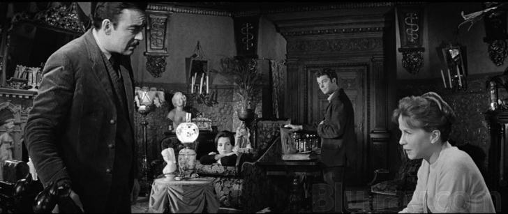
Rosemary’s Baby (1968) and the original The Haunting (1963) are great examples. The apartments inside The Dakota (the ones inhabited by the Woodhouses and the Castevets) are incredibly familiar – even to those who have never been inside the building. In the beginning of the film, the apartment still contains all the furniture of the previous owner: an old woman. It’s clear that the place belonged to someone as it is filled with character and style we would associate with an old woman. But more than that, the apartment is warm, cozy and inviting – the perfect trap every horror fan recognizes.


Even the Castevets’ apartment shares the same nature: it reflects the mask of niceness the couple is using in order to lure Guy and Rosemary. Even after a total makeover (after they move in), the Woodhouses’ apartment has not lost any of those qualities. The horror benefits from the familiarity we feel when we see those spaces.
In Robert Wise’s The Haunting, it’s all played in a similar way. The mansion may be big and lush. However, it’s filled with the same fundamental nature you expect in such a place. The furniture, the objects, the paintings, the woodwork – it’s all gorgeous, but also profoundly human and inhabitable. It’s all (again) very familiar.
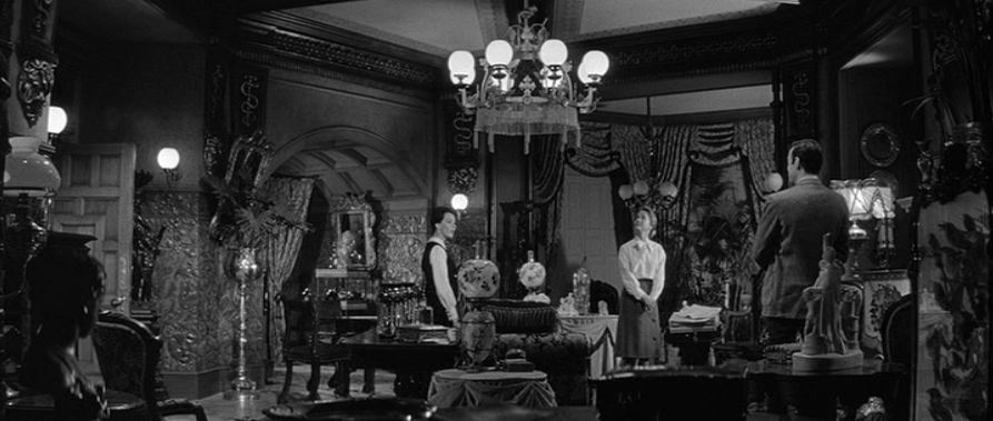

From the character’s point of view, it’s hard to believe such “dream house”, such wonderful place is an Evil place – but that’s the nature of the trap.
The mansion in the Jan de Bont’s remake has none of that. It looks like an empty mausoleum, cold and dull. It’s way too big – so big, it looks uninhabitable. The main room with minimal furniture, its colossal fireplace and massive stairs looks more like a public building like New York City’s Grand Central– or worse: a posh mall. It gives away the game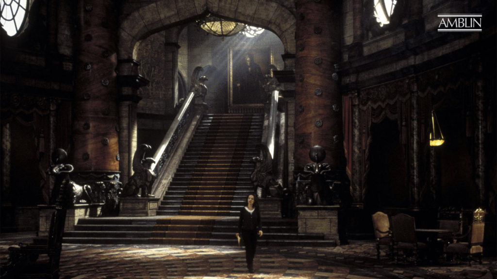 In Crimson Peak, the monumental sets are over-designed with exaggerated Baroque elements that, in a similar way, draw attention to themselves, away from the characters and the horror. It is all beautiful to look at, no doubt about it, but sadly, the result is that whenever you have a set that exaggerated, there is never darkness. Everything becomes eye-candy, demanding to be lit like a fashion commercial. It looks like Disney’s version of a horror-themed ride. It’s all pure expression from art directors who seem to put their self-importance above the genre’s most fundamental features: Evil plays better behind a mask of familiarity.
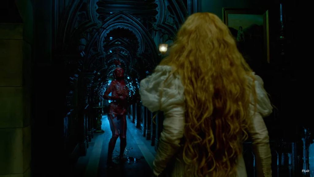

Films like Bram Stoker’s Dracula (1992) and The Shining (1980), on the other hand, succeed in having tons of expressiveness and monumentality without sacrificing familiarity. In Coppola’s case, we already know the story, the characters and what will happen. That’s all very familiar. It’s precisely because there are no surprises there that the film needs to run away from the classic Hammer visual setting. It needs to be arresting in different ways from dozens of previous Dracula films. It does and it feels like new. On The Shining, the monumentality of the Overlook Hotel remains grounded in self-restraint. Yes, the rooms, windows, corridors, kitchen – everything is big, but it still looks 100% like a real hotel. The element of deceit is there. The mask is there. It works perfectly.
Poltergeist (1982) remains the gold standard here. It plays so well the familiarity game, even the trailer tells you so: “the house looks just like the one next to it… and the one next to that… and the one next to that…” but wait 15 minutes into the film to start seeing the mask meticulously falling apart. The film’s last 5 minutes will give you things we would never assume were possible in such a self-restrained setting. That’s the beauty of the horror genre in full gear.
Are The Haunting (1999) and Crimson Peak bad films? Of course not. However, Hollywood, sometimes lets the eye-candy element take center stage, to a point where Evil becomes too self-evident – thus, making those films less effective, less powerful.
More Reviews:
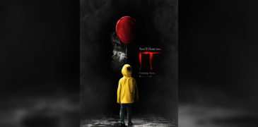
It (2017) Film Review – Reboot of a Stephen King Classic
The film It (2017) surprised me. In fact, I saw it five times due to how much I enjoyed it! Unlike a majority of modern horror films, it focused more…
Senritsu Kaiki File Kowasugi! File 06: The Most Terrifying Movie In History! (2014) Film Review- Kudo against ghosts and science!
No one is prepared for the sixth installment of the Senritsu Kaiki films. Koji Shiraishi, a consistently ambitious director, has made the found footage genre his playground, and we’re fortunate…

The Maid (2021) Film Review – Thai Horror at FrightFest
The Maid takes place in a sumptuous mansion, where Joy is the most recent maid in a high-turnover position. Upon her first introduction, she learns the rules of the house,…
![Livescreamers (2023) Film Review – Scream Your Heart Out [Unnamed Footage Festival 7]](https://www.grimoireofhorror.com/wp-content/uploads/2024/03/Livescreamers-2023-cover-Fixed-365x180.jpg)
Livescreamers (2023) Film Review – Scream Your Heart Out [Unnamed Footage Festival 7]
Not since 2006’s Stay Alive has video gaming been in the spotlight of horror in the way it is in 2023’s Livescreamers. Directed by Michelle Iannantuono, this sequel to the…
![Satan War (1979) Film Review – We Have Amityville at Home! [Fantastic Fest]](https://www.grimoireofhorror.com/wp-content/uploads/2024/09/Satan-War-cover-365x180.jpg)
Satan War (1979) Film Review – We Have Amityville at Home! [Fantastic Fest]
Satan War is a 1979 Satanic exploitation horror, written and directed by Bart La Rue. Whilst mostly known as a TV actor who had starred in over 20 roles, including…
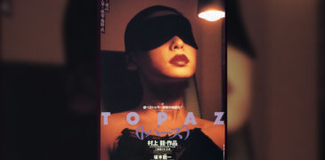
Tokyo Decadence (1992) Film Review – The Decadence of Man
Tokyo Decadence, also known as Topaz or Dreams of Topaz, is a 1992 S&M pinku drama, written and directed by Ryû Murakami. Although seen as a cult classic in Japan,…